Project Overview
MyGoAbroad is part of GoAbroad's ecosystem and was designed for users — mainly students and young professionals — who are exploring opportunities to study, volunteer, or work abroad. While GoAbroad.com focuses on listing and managing global programs, MyGoAbroad serves as the user-facing platform where individuals can browse, save, and compare different programs that match their interests.
The goal of this redesign was to modernize the experience, making it easier and more enjoyable for users to discover the right program for them. The project focused on improving navigation, introducing personalized recommendations, and creating a cleaner, more engaging interface that reflects the spirit of global exploration.
Project Details
Target Audience & Color Strategy
The target audience for MyGoAbroad.com includes students, recent graduates, and young professionals who are interested in international experiences such as studying abroad, volunteering abroad, or working abroad. The audience is predominantly English-speaking and located in the United States, Canada, Australia, and the United Kingdom. At the time of the redesign, the demographic was predominantly female and consisted of young professionals aged 18-30. The color palette was carefully selected to align with GoAbroad.com's brand identity while creating a fresh, modern feel for MyGoAbroad. The colors were chosen to appeal to the target demographic, creating a sense of trust, energy, and global adventure while balancing professional credibility with approachable warmth.
Design Goals
Improve User Experience
Create an intuitive, modern interface that makes discovering and comparing study abroad programs effortless and engaging for students.
Increase User Engagement
Transform the platform into a destination where students actively save programs, get personalized recommendations, and feel confident about their study abroad decisions.
Mobile-First Design
After noticing a significant increase in mobile users, we prioritized mobile-first design to ensure seamless research and comparison on phones.
Design System & Development Process
Style Guides & Libraries
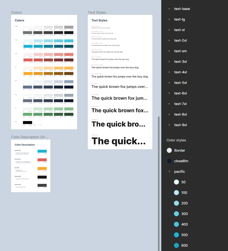
I spent months building out a comprehensive design system in Figma, creating consistent text styles, color palettes, and spacing guidelines. This was back when Figma didn't have variables yet, so I had to manually organize everything using the style panel and naming conventions. It was quite the learning curve, but it really helped me understand the importance of having a solid foundation before diving into the actual design work.
Components
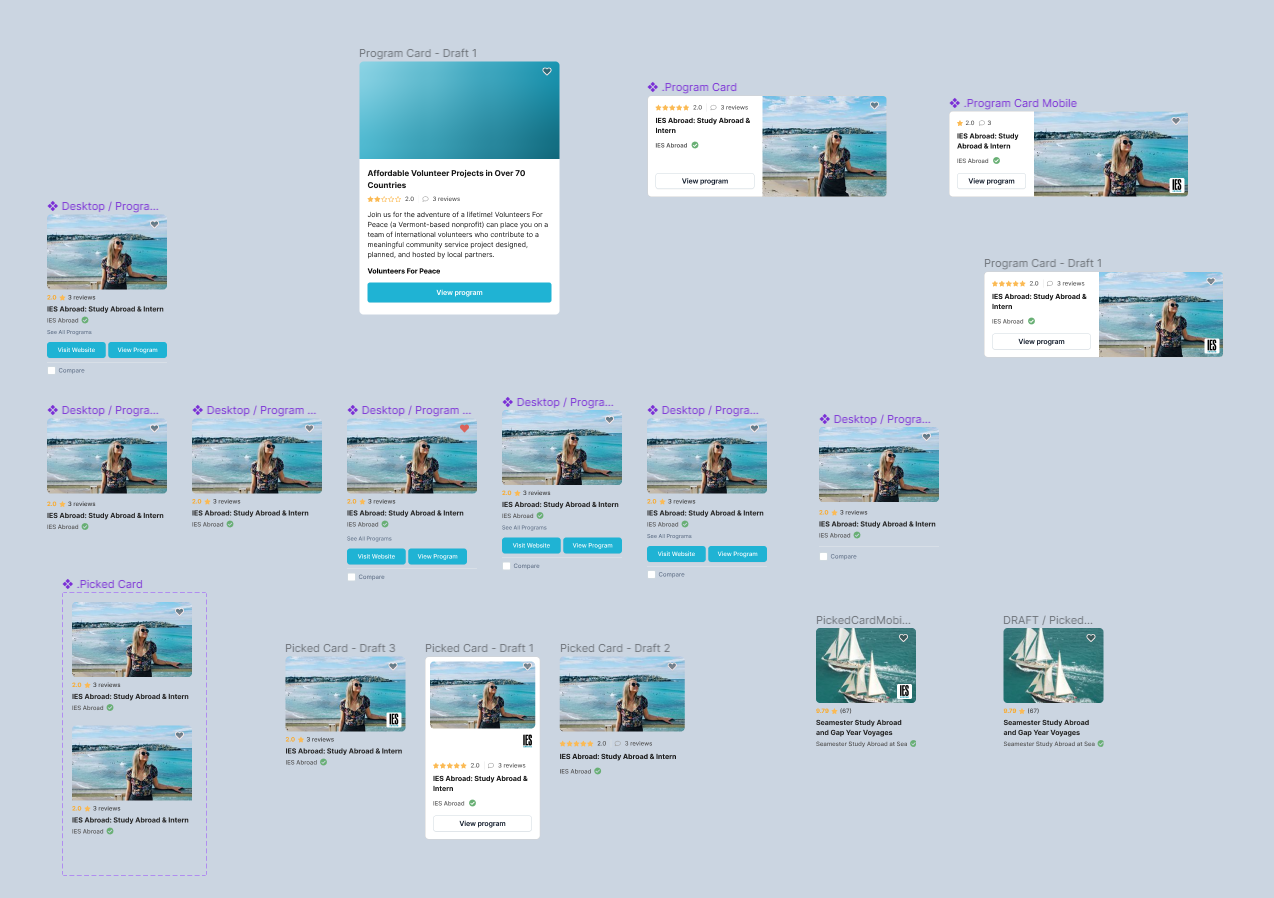
This is where things got really exciting! I was learning how to create variant components using Figma's new auto layout feature and component properties. It was like discovering a whole new world of design efficiency. I built reusable components for cards, buttons, and other UI elements, which made iterating on the MyGoAbroad platform so much faster and more consistent.
Prototyping
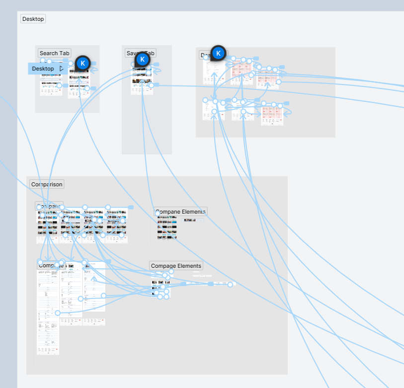
I developed all the prototypes in Figma from June 2022 through the end of the year. Working as efficiently as possible at the time, I had to get creative since there were no interactions or variables in Figma yet. I used basic linking and overlays to create user flows that would help the team understand how the MyGoAbroad experience would work in practice.
Final Product and Key Features
Improved UI & New Features
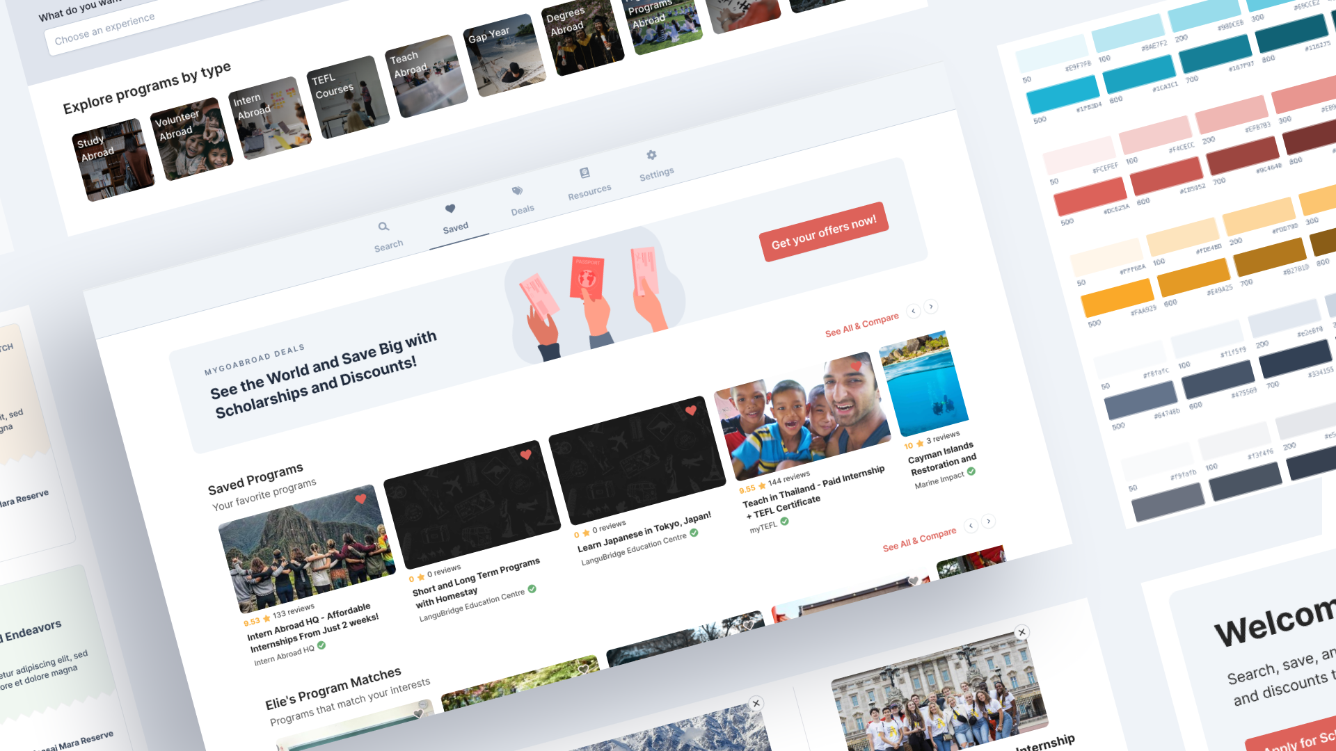
I redesigned the MyGoAbroad platform with a fresh, modern interface and introduced several new features to enhance the user experience. The new design includes a seamless login system that syncs with GoAbroad.com, a clean and intuitive dashboard, and powerful new capabilities for program discovery and engagement.
- • Seamless login integration with GoAbroad.com
- • Clean, modern dashboard design
- • Save and organize favorite programs
- • Smart program matching and recommendations
- • Exclusive deals and offers from partner organizations
- • Streamlined user flow and navigation
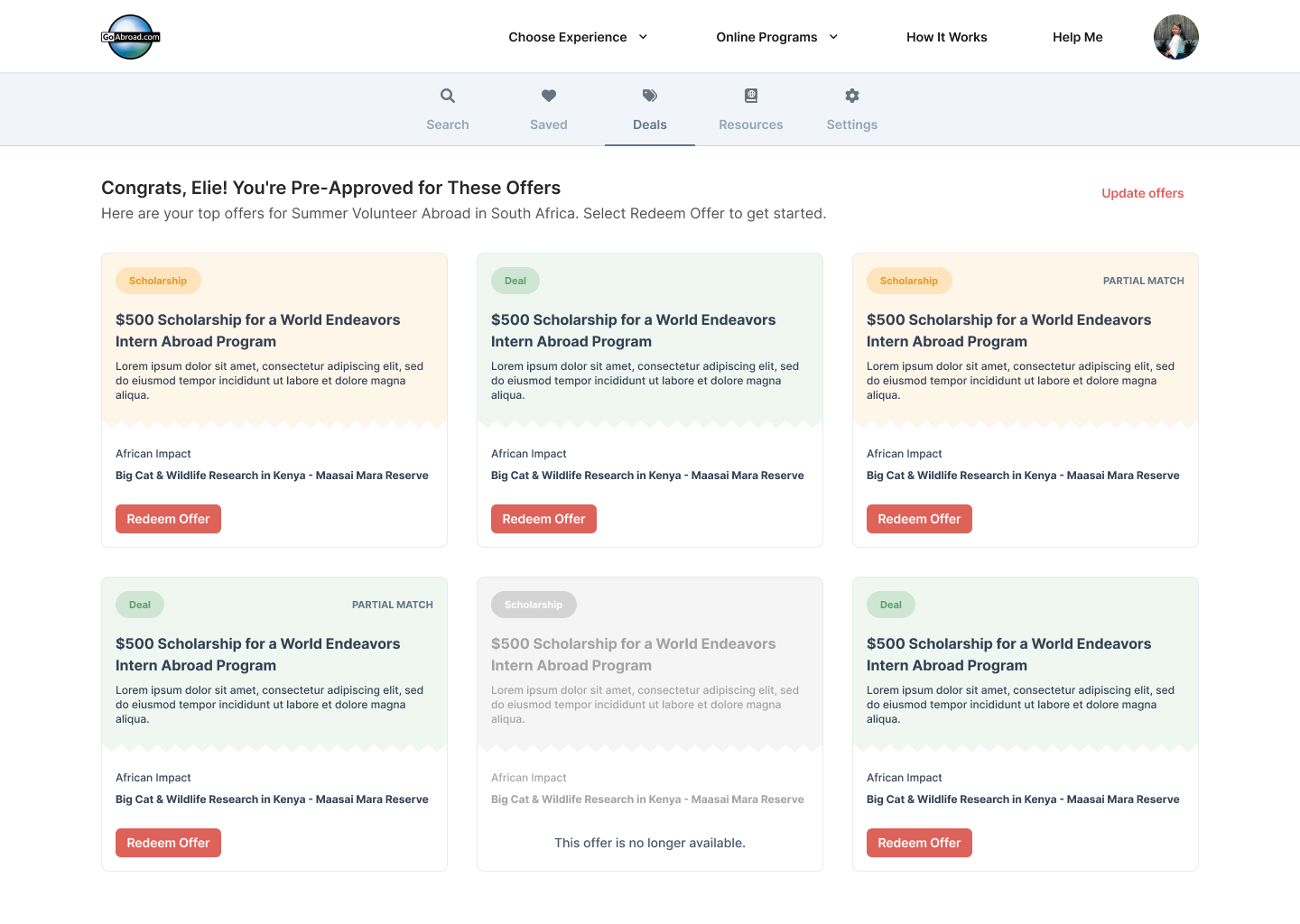
Comparing Programs
The team had trouble making it easy for users to compare programs on MyGoAbroad. With my help, we designed a simple and efficient program comparison feature that improved the user experience.
- • Intuitive program comparison interface
- • Side-by-side feature comparison
- • Clear visual hierarchy for program details
- • Streamlined decision-making process
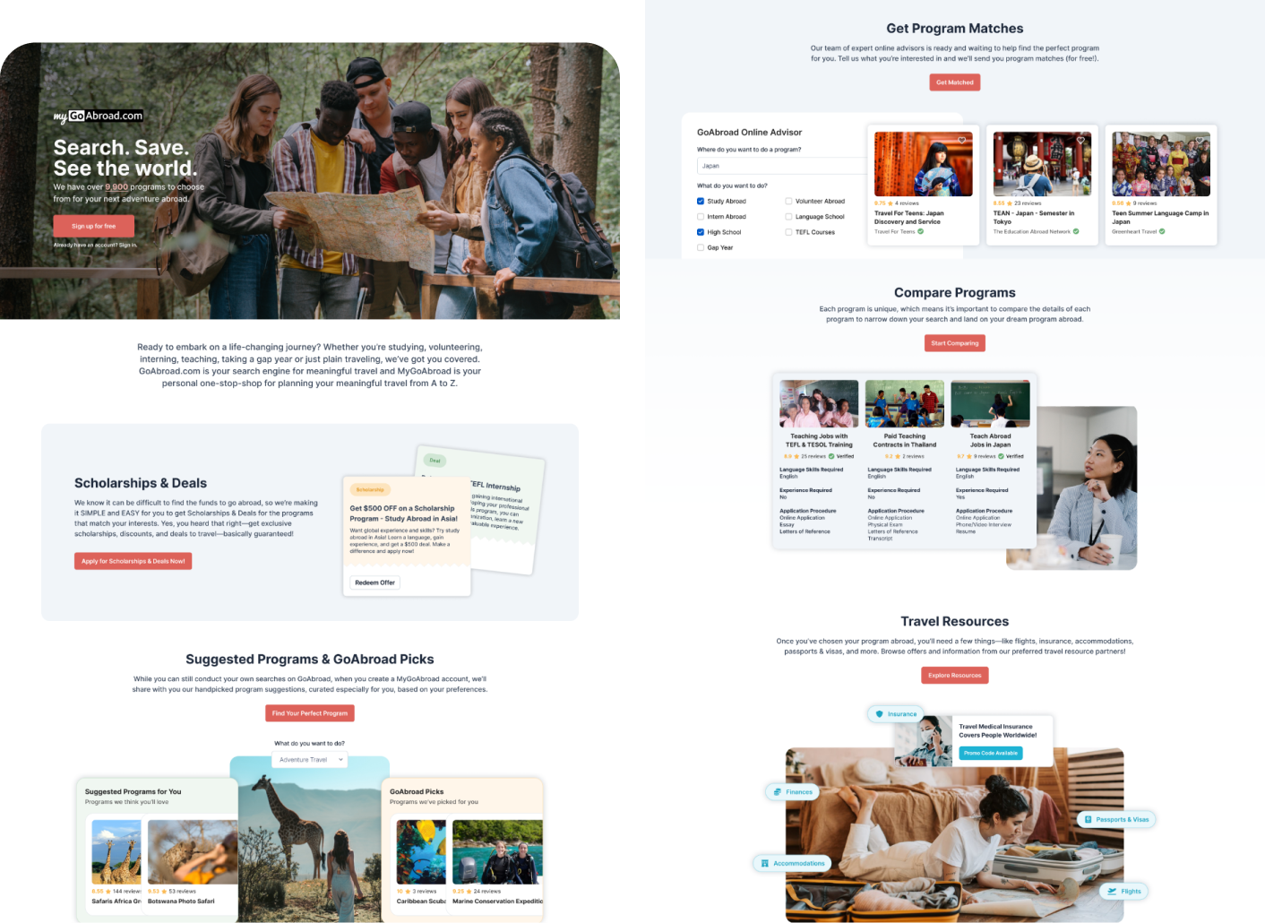
MyGoAbroad Landing Page
Developed a landing page design highlighting the key features and benefits, allowing users to quickly understand what MyGoAbroad has to offer.
- • Hero section with compelling messaging
- • Scholarship & Deals showcase
- • Suggested Programs & GoAbroad Picks
- • Clear call-to-action elements